102CR Portfolio
102CR: Portfolio:
UI Design:
For this task I had to come up with a menu GUI for the ALL project I was developing. The interactive storyline was set in cyberspace, so I tried to give my piece a digital feel. Since the game had a very minimalist style, I tried to do the same with my menu.
Below are the basic objects chosen for each part, as well as the rough version of the Enterprise.

When one side of the Enterprise was finished, since it is a symmetrical design, the wing was cloned, and a mirror modifier was added. The symmetry modifier was used on the bridge of the ship so both sides matched without me having to model both sides of it.

Once I had the walk cycle for one leg correct, I saved the animation for it, and loaded it into the other leg. This required mapping the rotation of each leg piece to its counterpart, using the map animation editor.
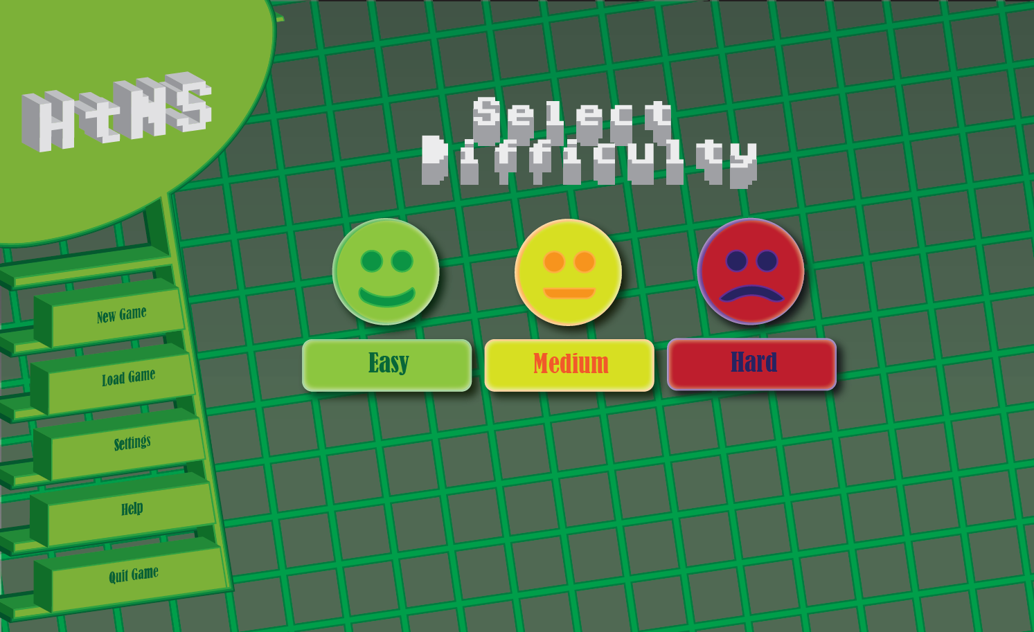
For this task I had to come up with a menu GUI for the ALL project I was developing. The interactive storyline was set in cyberspace, so I tried to give my piece a digital feel. Since the game had a very minimalist style, I tried to do the same with my menu.
Final Piece:

The buttons were drawn flat first. I combined the font to be used onto the shapes.
I used the 3D effect function on the menu, which made it more visually interesting, and helped match the visual style of the interactive story. I had to manually move every part of the menu to make it line up, as the 3D doesn’t work on the grid.
A deliberately retro looking font, Adore64, was chosen for the title and the on screen text. This font was hard to read on the buttons once they were rendered in 3D, so a different font was chosen for them. This font was also used for the on screen buttons.

I opted to make the choice between options easier
The difficulty selection buttons were created using a series of shapes and applying a warp effect to the basic shape to create a mouth. To give these buttons a more 3D look, a drop shadow was applied to them, which helps to lift them off the page, as well as a glow effect to give further depth.
In retrospect with this task, I don’t think the font choices were ideal,and for a commercial project, a customised font would be the way to go.
The final product would also contain in-game artwork to replace the grid pattern. Whilst I did get the minimalist look I was aiming for, there are portions of the piece that look too simple even with the applied 3D, such as the upper corner.
2D Animation:
Final Piece:
For this piece, I developed an animation from a still photograph, using a combination of photoshop techniques developed in week 1 and animation techniques learned in week 5. The two pieces of software used to develop this animation was Adobe Photoshop and Adobe After Effects. My goal was to tell a narrative during the animation - that of someone lost forever in the woods.
I started off by doing a very rough sketch of the idea I wanted to do. 
I used this simple sketch as the basis. I used a grid to help get exact line placement.The buttons were drawn flat first. I combined the font to be used onto the shapes.
I used the 3D effect function on the menu, which made it more visually interesting, and helped match the visual style of the interactive story. I had to manually move every part of the menu to make it line up, as the 3D doesn’t work on the grid.
A deliberately retro looking font, Adore64, was chosen for the title and the on screen text. This font was hard to read on the buttons once they were rendered in 3D, so a different font was chosen for them. This font was also used for the on screen buttons.
I opted to make the choice between options easier
The difficulty selection buttons were created using a series of shapes and applying a warp effect to the basic shape to create a mouth. To give these buttons a more 3D look, a drop shadow was applied to them, which helps to lift them off the page, as well as a glow effect to give further depth.
In retrospect with this task, I don’t think the font choices were ideal,and for a commercial project, a customised font would be the way to go.
The final product would also contain in-game artwork to replace the grid pattern. Whilst I did get the minimalist look I was aiming for, there are portions of the piece that look too simple even with the applied 3D, such as the upper corner.
2D Animation:
Final Piece:
This is the original photograph:

I decided to try and use a few layers to give the illusion of depth in the animation - one for my friend, one for the background trees, and layers for the foreground trees. Using Photoshop, the foreground trees and my friend were cut from the image and using content aware fill in select places. The image is busy enough that it is hard to tell where the photo-shopping occurs, and the other layers also benefit from this, as the anti-aliasing combined with with the busy background help the lifted elements blend in.
The photo was also cleaned up to remove stray branches that obscured objects to make cutting out the individual elements easier, as well as the stay piece of rubbish that made it into the photograph.
I decided to try and use a few layers to give the illusion of depth in the animation - one for my friend, one for the background trees, and layers for the foreground trees. Using Photoshop, the foreground trees and my friend were cut from the image and using content aware fill in select places. The image is busy enough that it is hard to tell where the photo-shopping occurs, and the other layers also benefit from this, as the anti-aliasing combined with with the busy background help the lifted elements blend in.
Finally, to make the focus the person in the photo, the entire image was cropped, particularly removing most of the sunlight, making the forest look enclosed in.
The layers cut out are shown below:


The images were then scaled and moved in After Effects, and the foreground trees were moved to give an additional sense of movement.
During the animation, the forest is rendered in grayscale, as the and the colour is drained from the image as the person enters. This is to empathise the loss. Finally I applied a constantly changing fractal noise effect over the top, and the person fades from view, the narrative of the animation suggesting he has been lost forever in these woods.
The final animation has the logo, which phases through the front tree as it moves closer to the screen. It was accomplished by using two layers, one below the tree trunk, and one above, both using the same animation, but the upper layer slowly fading in.
I’m not entirely happy with this part of the animation, but I could not think how to accomplish this without using the fade effect. It also seems rather basic compared to the rest of the animation.
In hindsight I also think the photograph could’ve been more composed when initially photographed. Additional layers could also have been used to cover my friend’s feet, lost in the undergrowth, but my attempts at doing this did not look natural with the animation, so I ended up not using this layer.
Advanced 3D Modelling:
During this task, I 3D Modelled the USS Enterprise based off blueprints. The result is a model that is accurate to the dimensions found in the blueprints. Below is the final model. The blueprint is Matt Jeffries (1996).
Final Piece:


 Appropriate objects were chosen for each notable piece of the Enterprise, (for example, a cylinder basic object was chosen for the body of the ship), and I modified vertices and polygons to better match the shape of the blueprint as I went along. Other functions such as extrude, were used to expand the shape, such as the edge of the dish at the front of the enterprise.

Final Piece:

Below are the basic objects chosen for each part, as well as the rough version of the Enterprise.
When one side of the Enterprise was finished, since it is a symmetrical design, the wing was cloned, and a mirror modifier was added. The symmetry modifier was used on the bridge of the ship so both sides matched without me having to model both sides of it.
Many details on the Enterprise would be added through textures and UV wrapping, however things such as windows could be added to the 3D model itself. This would be accomplished through Boolean operands with smaller objects and either subtracting or adding them to the model.
3D Animation:
Final Piece:

I had issues understanding the concept behind skeletal animation. I also wasn’t sure it was right for my model, so I opted to key-frame animate the mech. I would rotate a piece to its desired location, and then set a key-frame, then 3DSMax would animate the in-betweens. This also proved fairly difficult to get right. As an unfortunate consequence of the design, there are clipping issues with the animation, and I don’t think I could fix this without entirely altering the design.

I kept separate each part that would be moving independently of each other, such as each leg part, the guns, the crotch, etc
.
I used the link tool to link the leg parts to each other, which means if one part was rotated, the rest would be rotated in alongside it. Keeping them as separate objects meant I could further rotate the pieces and give the mech a walk cycle. The upper guns were also linked to the body so they would rotate as the body swerved around, but could themselves be moved if I so wished.
3D Animation:
Final Piece:
This model was built from a combination of simple shapes, box modelling and spline modelling, depending on the part required. Like the USS Enterprise model, a blueprint was used for the design of the model, the blueprint being by Kilroy (2012)
I kept separate each part that would be moving independently of each other, such as each leg part, the guns, the crotch, etc
.
I used the link tool to link the leg parts to each other, which means if one part was rotated, the rest would be rotated in alongside it. Keeping them as separate objects meant I could further rotate the pieces and give the mech a walk cycle. The upper guns were also linked to the body so they would rotate as the body swerved around, but could themselves be moved if I so wished.
Once imported, I then moved the keyframes around so that when the left leg is on the ground, the right leg is lifting. This at least gives it a semi-convincing walk cycle.
Bibliography:
USS Enterprise Blueprint: Matt Jeffries (1996)
http://www.cygnus-x1.net/links/lcars/uss-enterprise-space-cruiser.php
Mecha Blueprint: Kilroy (2012)
https://mwomercs.com/forums/topic/87787-mech-blueprints/page__view__findpost__p__1676570
Bibliography:
USS Enterprise Blueprint: Matt Jeffries (1996)
http://www.cygnus-x1.net/links/lcars/uss-enterprise-space-cruiser.php
Mecha Blueprint: Kilroy (2012)
https://mwomercs.com/forums/topic/87787-mech-blueprints/page__view__findpost__p__1676570


Comments
Post a Comment